Global Banking App
A universal multicultural banking experience
A client in banking asked to help set a strategic vision of aligning their multiple market specific banking apps into one cohesive global banking app so they are better positioned to provide a superior experience for their users with a focus on retention and aquisitions.
The Challenge
- To gain an understanding of the existing banking experience, their brand messaging, and the relationships between stakeholders as it relates to how they serve their users.
- To identify opportunity areas and propose a future state experience of the banking journey with actionable product and service concepts that the client could implement in the near future.
My Role
My role in the team was to conduct design research, provide UX strategy, design for the component and flow concepts, and revamp UI. The other members of my team included a Project Manager, Content Strategist, and Data Analyst.
Usefulness
Stakeholder Research
- Team Immersion
I sat in a meeting about the project with the stakeholders to gain a better understanding around the drive behind the desire to launch this project, what outcomes were important to them, and the user's role in their decision making. - Individual interviews
I then sat with a few different stakeholders individually and asked them questions away from the group to better understand the various representations of different areas within the team. - Analyzing data metrics
I asked for a detailed report on the data surrounding the products usage, customer retention and aquisitions, as well as their financial report to work with the Data Anlaysit on creating hypothesis surrounding areas of opportunity and the correlation between product performance and revenue.


User Research
- Customer immersion
I wanted to experience what the user experiences. I downloaded the bank app for my market (United States), explored, and tried to perform a set of tasks, primarily sending money internationally and domestically. - Selecting the test group
I selected users with different backgrounds from various markets around the globe to make up my test pool. This was to find common pain points amongst the diversity of users to identify common areas of opportunity. - Individual interviews
I wanted to gain a better understanding on what was important to the user, what tasks they needed to fulfill, what is their current feeling about banking, and what areas of the current experience is frustrating. - Analyzing data metrics
I asked for a analytic report on drop offs within the existing product journeys to work with the Data Analyst to gain insight into where there may be areas of opportunity.
Stakeholder and User Personas
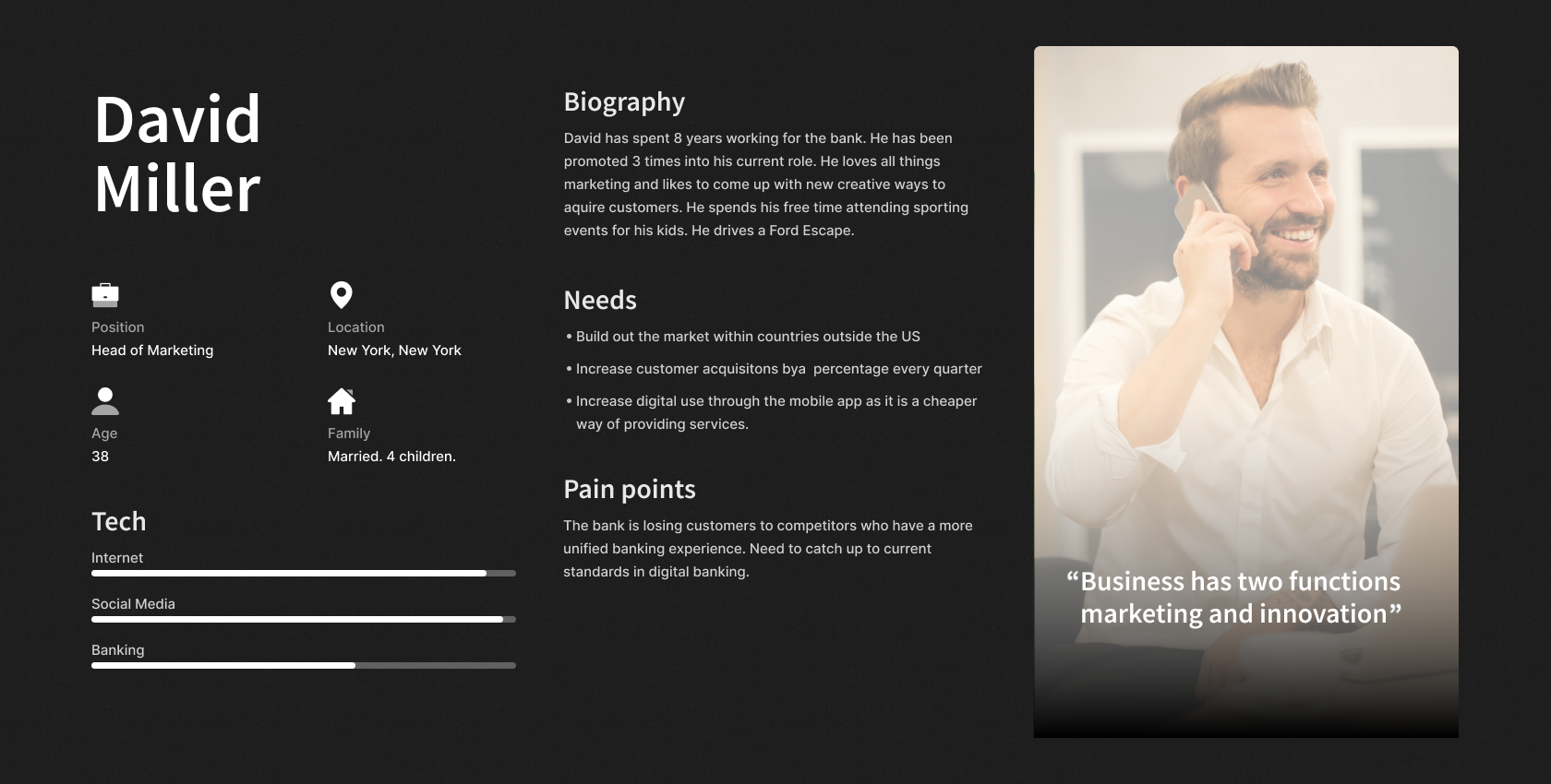
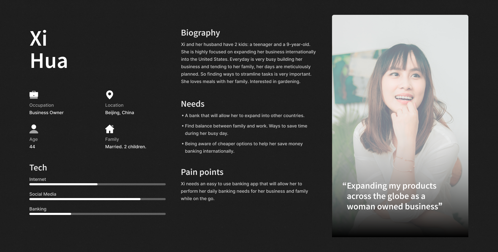
Take Aways
Problems
These are the most common probems for users across the globe.
- User has to download multiple market specific banking apps to manage their international finances
- Banking jargon is confusing
- The process to send money is long and cumbersom
- Users view banking as a chore or errand
- The user doesn't know what the cheapest fastest mode of sending money is within their options
- There's no way to store contacts to send money quickly
Opportunities
These are found within the problems that were discovered.
- Create one universal banking app where users can perform all of their domestic and international banking needs
- Using language that is familair to the user
- Shorten the steps it takes to send money by reducing the amount of decisions the user has to make
- Utilize motion and interaction to make banking more lively
- Surface the cheapest and quickest way to send money
- Create an international contact library to quickly send money to
Usability
Action and Navigation Component Prototyping
A/B testing
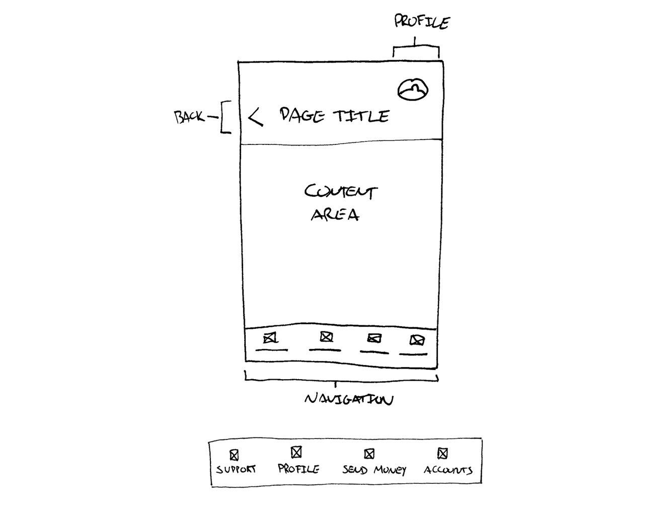
Existing Components
User Testing Learnings
When testing users I found that elements at the top of the screen were hard and sometimes impossible to reach with one hand. The user would sometimes drop their phone, user two hands, or strain to reach elements at the top.
Actions are scattered throughout the screen causing the user to have to scan and search the page for the action location and element. This causes stress, more time, and is very hard to reach with the user's thumb.
The navigation elements are just confirming what the page titles are doing and letting the user know which screen they are on. Because the headers are used to do this job the navigation on the first teir isn't needed.
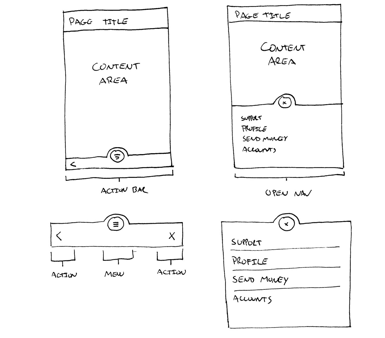
Proposed Action Bar Component
User Testing Learnings
Creating a component that houses all of the action and naviagation elements in one area reduces the amount of time the user has to spend looking and trying to reach various interaction points throughout the screen.
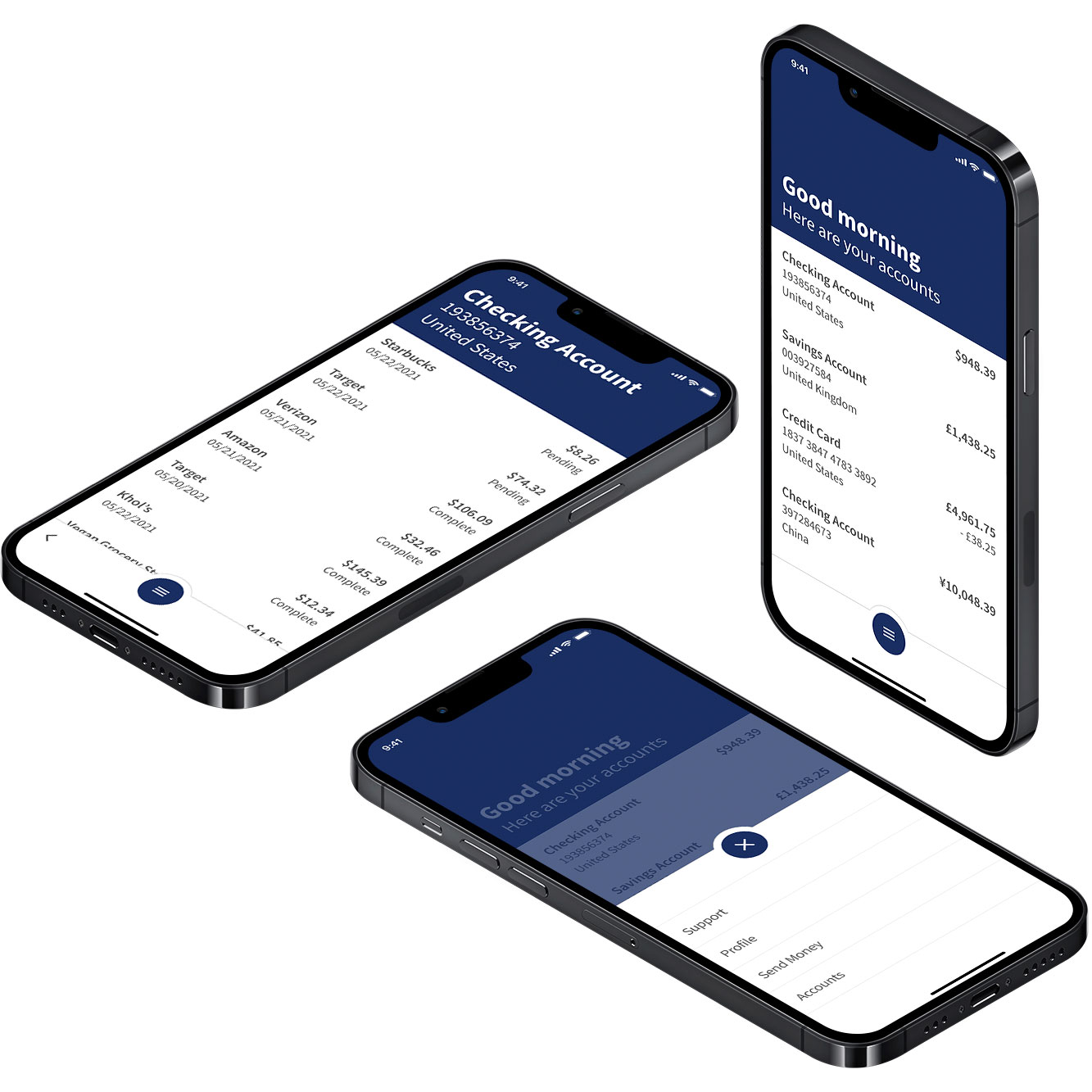
Implementing a more mobile friendly approach I placed the action bar in the hot spot of the thumb so the user can easily access primary interaction points.
I housed all of the navigation elements into a primary menu button and removed them from the first teir of the design to simplify and reduce visual noise to allow the user to complete the primary task of each screen without disctraction.
User Flow Prototyping
Moderated user testing
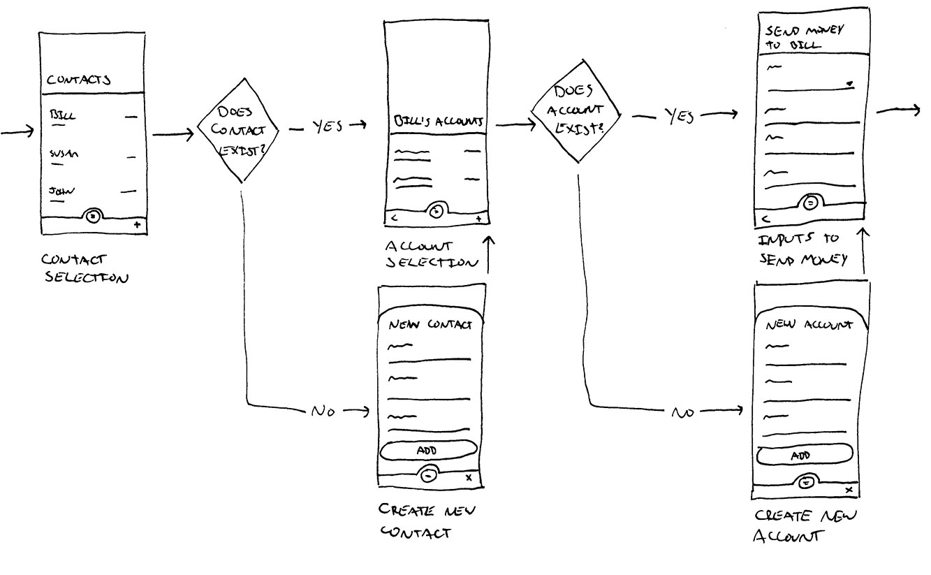
Rethinking the Send Money Flow
The main objective here was to simplfy and reduce the amount of decisions the user has to make during a complicated process of sending money internationally or domestically. Even though this process is technically difficuly from a banking perspective the user's experience should be quick and easy.
User Testing Learnings
I found that I reduced the amount of time the user has to take to complete the flow by 5 minutes.
Visual Design
One App
It was top priority for both users and stakeholders to have one app that houses all of the international and domestic accounts. To align with the holistic view of banking I housed all accounts on one screen.
During testing I found that implemeneting country dividers and flag icons within the UI created a lot of visual noise and complicated the process of finding an account at a glance. I opted to take a more minimal approach by utilizing text as the primary comminucating source.
To make it even easier for the user the list is sorted by most frequently used. I found what was most important to the user when selecting an account was the frequency not by country or territory.
Simple Communication
Across the globe people found banking jargon confusing. It was important to speak to the user in ways they can understand. This meant to avoid internal banking terms when aplicable with more user friendly communication.
One thing users enjoy is the relationships or customer service of in branch employees. It was important to use simple and friendly language that gives the sense of the in person banking experience.
Less Work
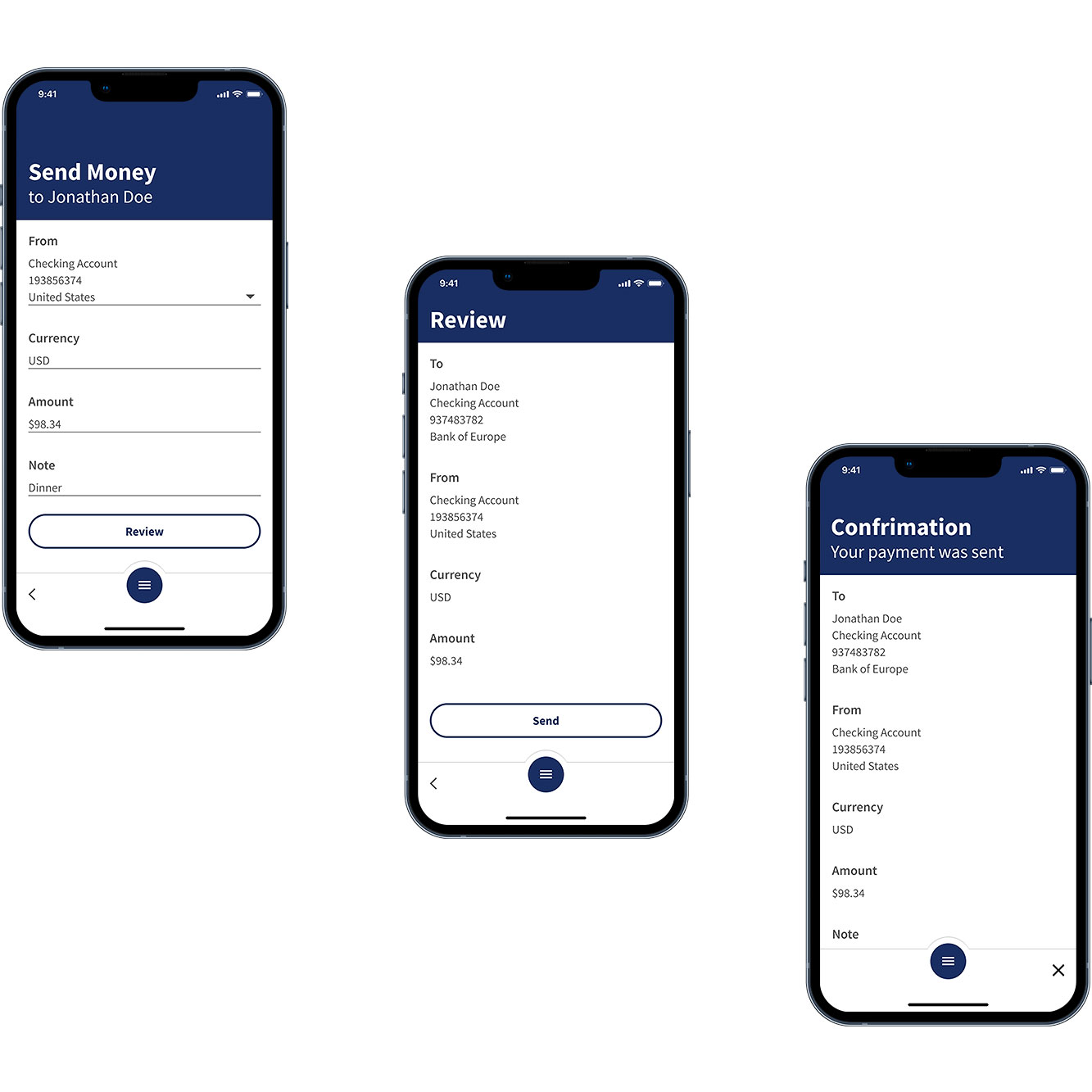
The task of sending money domestically or internationally is a long process that required the user to make a lot of decisions and enter a lot of information. Rethinking entry points and reducing unneeded steps throughout the journey reduced the amount of time and effort it took for the user to send money across the globe.
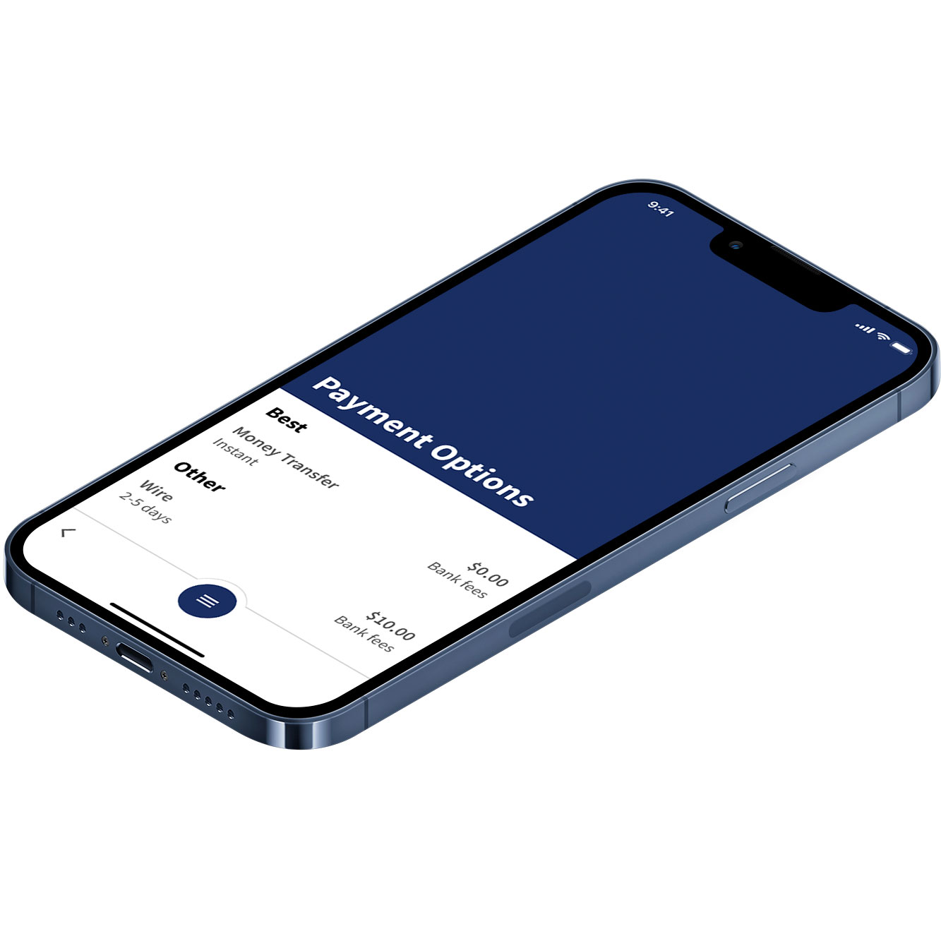
The user didn't care about the mode of sending money like wires, bank transfer, etc. What they did care about was the cheapest and fastest way to send the money. I surfaced the best options for the user that meet those criterias.
Create Delight
According to the users banking is boring. I implemented motion into the interactions to create a more lively enviroment for users to perform their banking errands. We found that by making a cold digital enviroment feel more organic it helps users stay interested in the task at hand.
Surface What's Important
During my interview process I discovered that customers did not find the mode of payment important but found the cheapest fastest payment method the deciding factor when sending money. Knowing this, I surfaced the cheapest fastest payment method to the user to streamline the flow and reduce the amount of decisions the user had to make. This is a small but impactful change from the previous experience of users having to pick from a list of payment options lacking cost and devliery speed.
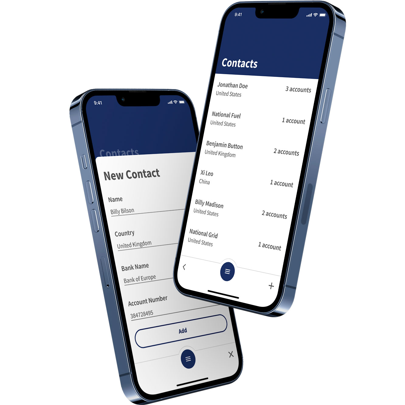
Contact Library
People around the world wanted a way to create and save contacts for future payments this way they can quickly choose the person or company they want to send money to without having to reenter the information every time.
Taking note from the Accounts screen I housed all of the contacts into one view and sorted them by frequency. We found that by sorting the contacts by frequency and not by alphabetical or country allowed the user to find the contact they were looking for quicker.
Success Metrics
+ 1 million monthly users
Customer retention and acquisitions increased drastically with an easier to use UI and better UX solutions that satisfy user needs.
Increased NPS score
Higher quality UI solutions lead to a better NPS score.
Reduction in support
A more intuitive solution lead to less calls to the customer support center for app related questions.
